Create a graph from File ‣ New Graph or the new graph button on the toolbar.
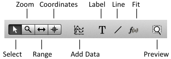
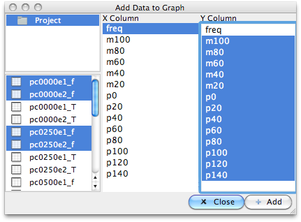
Click the Add Data button on the toolbar and select the worksheet(s) and columns to plot, then click “Add” and close.

You can also plot data by dragging a worksheet on to the graph. If no columns are set as ‘x’ or ‘y’, the default is to use the first column as x all the rest as y.
Note
You can also plot by right clicking a columns and selecting Plot
To zoom in a graph, select the zoom tool on the toolbar.
- To zoom in: drag with the left mouse button
- To zoom out: Shift + drag with the left mouse button
- To auto zoom to fit the data, double click in the graph, or press Z
With the right mouse button, you can pan around (if you click and drag near the middle of the plot) or push/pull the axes (click and drag near an axis).
Note
You can also zoom in and out by pressing the + and - keys
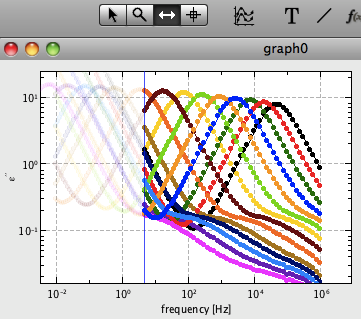
Choose the range tool on the toolbar. Then, you can set the visible range of the selected datasets using the mouse:
- set minimum x: left mouse button
- set maximum x: right mouse button
- reset to full range: double click on plot
You can show and hide curves from the context menu, or using the keyboard shortcuts S (Show), H (Hide), and O (show Only).


| Key | Action |
|---|---|
| 1, 2, 3 | Select, Zoom, Range tools |
| A | Select all curves |
| I | Invert selection |
| H | Hide curve(s) |
| S | Show curve(s) |
| O | Show Only |
| M | Mark |
| Z | Auto Zoom (Shift+Z : auto zoom to selected curves) |
| + / - | Zoom in / out |
| K / L | Change x / y axis between linear and log |
Shortcuts for setting curve properties
| Key | Action |
|---|---|
| C + number (0-9) | Set color of selected curves |
| C + right arrow | Set series of colors for selected curves |
| C + up/down arrow | Next/previous color |
| B + number (0-9) | Set symbol |
| B + right arrow | Set series of symbols |
| B + up/down arrow | Next/previous symbol |
| X + number (0-9) | Set symbol size |
| X + up/down arrow | Increase/decrease symbol size |